Overview
This page provides an overview of the AppStudio Designer’s UIs and their functionalities. It covers the key UI components, their layout, and how they work together to streamline your design process. By understanding these elements, you’ll be able to navigate AppStudio Designer more effectively.Application Builder UI
On opening the project, you’ll see the Application Builder, which consists of three main sections Navigation Bar, Toolbar, and Canvas.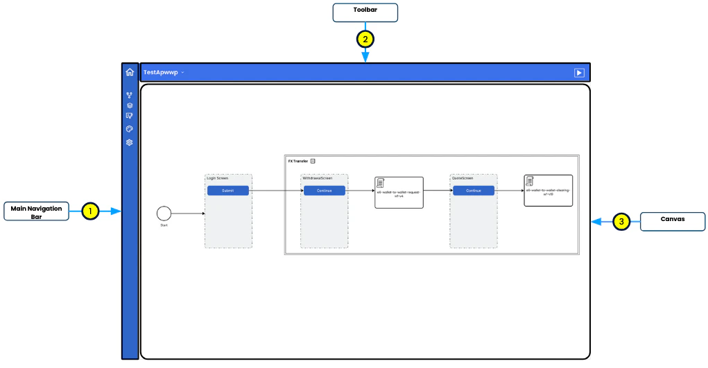
Main Navigation Bar
This sidebar offers quick access to the primary tools and sections of the Application Builder. Each icon represents a specific function:- Home: Links to the “My Projects” section, where you can create new apps, manage existing ones, and choose templates for quick starts.
- Storyboard: Provides a view and management of the application’s flow.
- Screens: Enables the viewing and editing of screens.
- My Workflows: Allows viewing and editing of workflows.
- Theme: Manages the theme, including colors and fonts.
- Settings: Manages the application’s name, logo, and splash screen.
Toolbar
The Toolbar, located at the top of the app builder, provides easy access to numerous tools and features essential for managing and previewing your application.- Application Name: Displays the name of the current project (e.g., “EPISODESIXDEMOAPP”), helping users easily identify the app they are working on.
- Download Application Definition: A button that allows users to download the entire application definition as a JSON file. This is useful for backups, sharing, or exporting the app’s structure and logic.
- Run: A button that provides a live preview of the application. This feature allows users to see how their changes will look and function in real time without leaving the design environment.
Canvas
This section dynamically changes based on the selection in the Main Navigation Bar. When the user initially opens the Application Builder, the Storyboard view is loaded by default.Storyboard
A comprehensive view of the app’s flow, allowing users to visualize connections and transitions between different screens and workflows.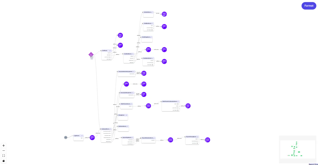
- Flow Diagram: The central area displays a flowchart representing the application’s logic and workflows, helping users understand how different components of the app interact.
- Nodes and Connections: Each node represents a screen, decision point, or workflow in the app, connected by lines that indicate the flow of actions or data between these elements.
- Zoom Controls: Located at the bottom left, these controls allow zooming in and out for a closer look or an overview of the entire application flow.
- Minimap: The bottom right corner contains a minimap for quick navigation across different parts of the flow diagram, providing a bird’s-eye view of the entire application flow.
Screens
This section enables the previewing and editing of each app screen by dragging and dropping widgets. This is where users design the app’s user interface.- Left Panel:
- Widgets: A list of available widgets that can be added to screens.
- Widget Tree: A hierarchical representation of the widgets used in the current screen.
- Canvas (Preview Screen): The main area where users can see a preview of the current screen and directly edit it.
- Right Panel (Property Window): This panel displays the properties of the selected widget or screen element, allowing for detailed customization.